# Happy Diwali
Firstly a very very Happy Diwali to all my readers. I wish you guys achieve great in your life and best wishes for this Diwali to you and your Family. Now we move to our topic on ' How to use tabs layout in Kodular Creator? ' Here firstly we would talk about some of FAQ's regarding Tabs Layout.
FAQ's about Tabs Layout:
1. What is actually Tab Layout?
If you didn't understood what do I mean by Tab Layout here inn this tutorial, then I am going to describe about Tab Layout. I would tell you about a example of Tab Layout which you may have used. You may have seen the tabs written 'Chats', 'Status' and 'Contact' in whatsapp. Our component of Tabs Layout is just like this. Here we can add a layout with a number of tabs which can be switched by clicking on them. They are used to carry out any action when anyone of them is clicked. You you didn't got how to use this then don't worry I will let you know how to use this tab layout during our tutorial.
2. Benefits and Uses of Tab Layout
If you are thinking what could be the benefits of using Tab Layout in our app, then I would like to tell the main benefits of using tab layout. The first benefit of using Tabs Layout is that it is user friendly and let your users to reach all of functions in your app without getting lost in your app. We can say that it provide you the best method to make your app user friendly. This also improve the overall experience of user throughout your app. So, this improve UI and UX of your app. You can use this layout in News app or any other app to manage different categories.
So, this was all about the FAQ's which could arise in your mind regarding Tabs Layout. Now, we are ready to move towards our tutorial. And here we start our tutorial on how to use tab layout in Kodular Creator.
How to add Tab Layout in Kodular Creator project?
To add Tab layout in your project you need to follow these steps:
Step 1: Open the project in which you want to add Tab Layout.
Step 2: Click on Navigation Section under the layout option.
Step 3: Find Tab layout in the components that you can see there.
Step 4: Now Drag and drop this component to your project.
And here you have successfully implemented Tab Layout component to your project.
Properties of Tab Layout
1. Width:
This option is used to set the width of the Tab Layout.
2. Tab active color:
This options let you to choose the color of tab that is active currently.
3. Tabs Background color:
This option sets the background color of the Tab Layout.
4. Tabs Indicator Color:
This options sets the color of indication of tabs in Tab layout.
5. Tabs Mode:
This option allow you to set whether you would like to keep your tabs scrollable or Fixed. This is useful when you have a large number of items inn your tab layout.
6. Tabs Text Color:
This option allow you to choose the desired color which you would like to use as your tabs text color.
7. Visible:
This option sets whether you would like to set the tab layout visible or invisible when screen initialise.
Main functions of Tab Layout
Now we are going to talk about the main functions or the main block's function of the Tab Layout Component. Here is our first Block or Function regarding 'How to use Tab layout in Kodular'
1. Add item (Without Considering Position )

This Block's function is to add a new tab to Tab Layout without considering the position that means the new tab will be placed after the previously added tabs. Here you can set the text to be shown for the new tab by providing text for title option. You can also add icon with the option of icon by providing name of icon in your assets in text block.
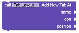
2. Add item (With Considering Position )

This Block's function is to add a new tab to Tab Layout with the position you want in form of number. Here you can set the text to be shown for the new tab by providing text for title option. You can also add icon with the option of icon by providing name of icon in your assets in text block. You can set the tab at position by providing the position of tab in form of number.
3. When Tab item selected

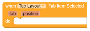
This block's function is to detect when a tab item is selected or clicked. This option gives the name of item selected by the variable 'tab' and position of item selected by variable 'position'. You can specify any action when any tab is selected by arranging blocks such like that...
So, by this method you can check which tab is selected then carry out any action by this.
Guys this was all for Tab Layout option and we will be back again with a more interesting topic until then......
Happy Diwali and Koding....


Comments
Post a Comment